LaunchCode
LaunchCode is a national nonprofit with headquarters in St. Louis, dedicated to creating economic opportunity for aspiring developers through job placement and training in technology. They are shrinking the tech gap and giving unemployed Americans the ability to teach themselves into a high-paying job.
As an independent design consultant for LaunchCode, I have assisted in everything from marketing campaigns to branding guidelines to UI/UX concepts for their website overhaul.
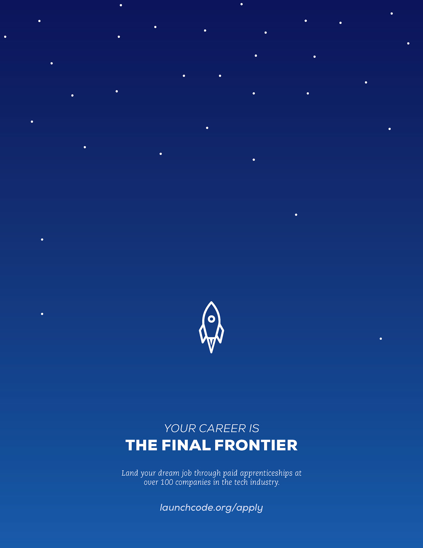
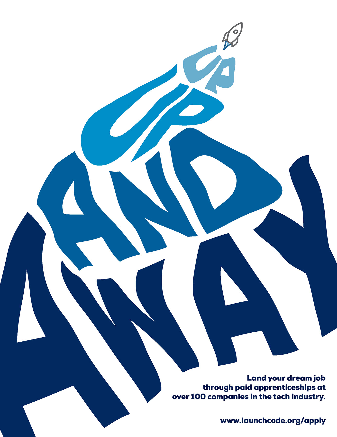
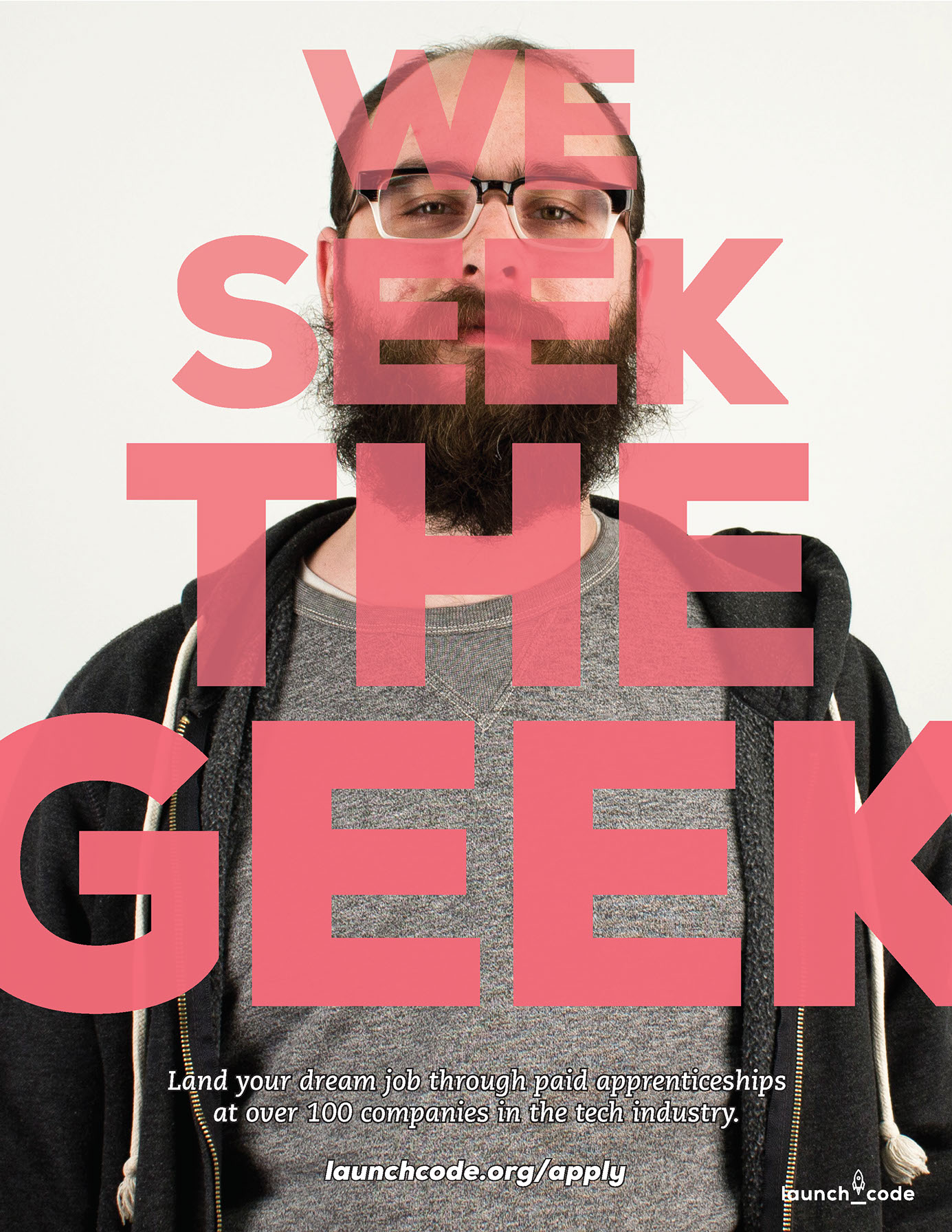
Poster Campaign
HOW CAN WE attract and excite creative young millennials to look into LaunchCode with a coffee-shop flyer campaign?
Website Mockups
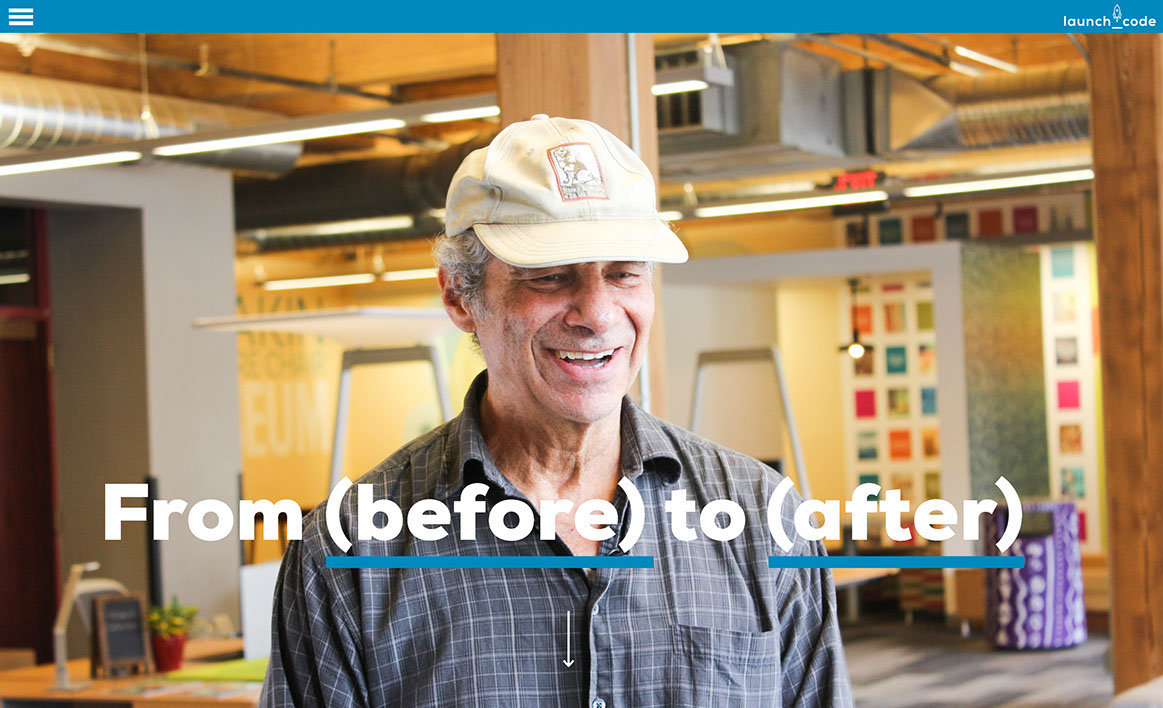
HCW redesign the website to emphasize the stories of individuals and clarify navigation for potential LaunchCoders, company partners, donors, and returning LaunchCoders?
Previously there was no cohesive tone to the website.
Previously "LaunchCode Stories" was buried, and there was very little human presence to the website.
My proposal:
A soundless video automatically plays full screen, showing the faces of real LaunchCoders, providing a feeling of authenticity and motivation.
A bold headline describes each LaunchCoder's job before and after LaunchCode, thus describing the LaunchCode process through its success stories.
Menu in the top left hand corner expands on hover.
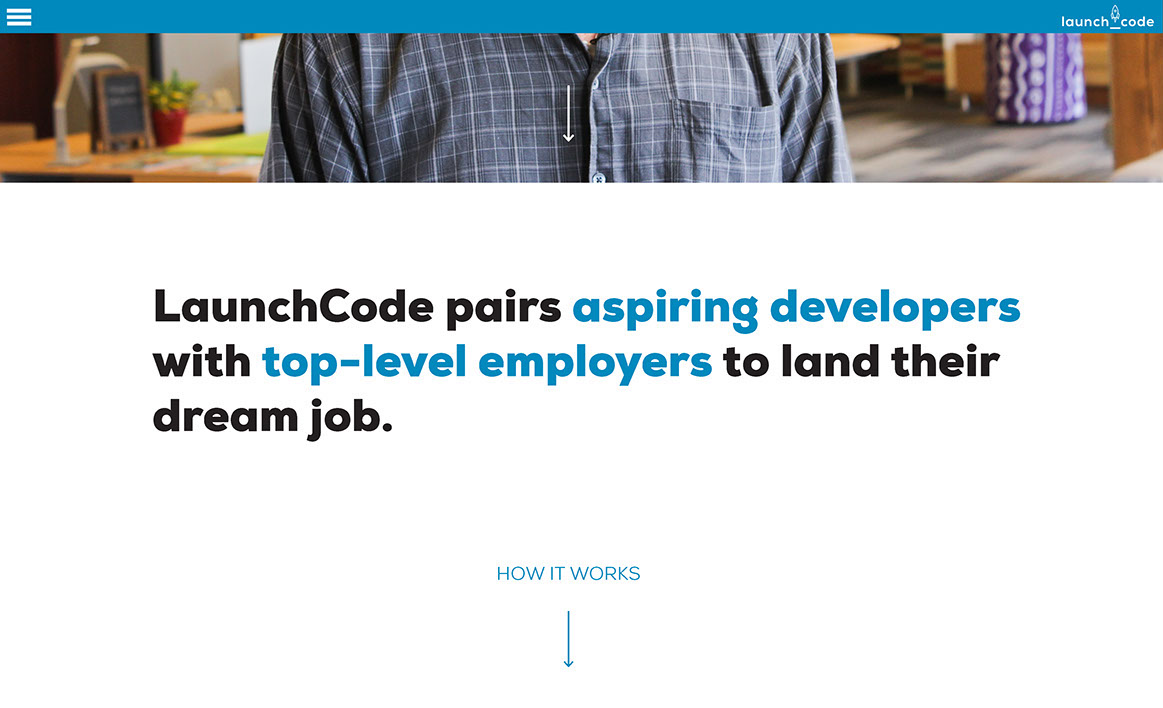
Previously in order to gain an understanding of what LaunchCode does, users have to click to watch the entire video on the homepage.
Previously the tagline was vague and didn't give the user a good sense of what LaunchCode does.
My proposal:
As the user scrolls, the brief description lets them know immediately what LaunchCode does.
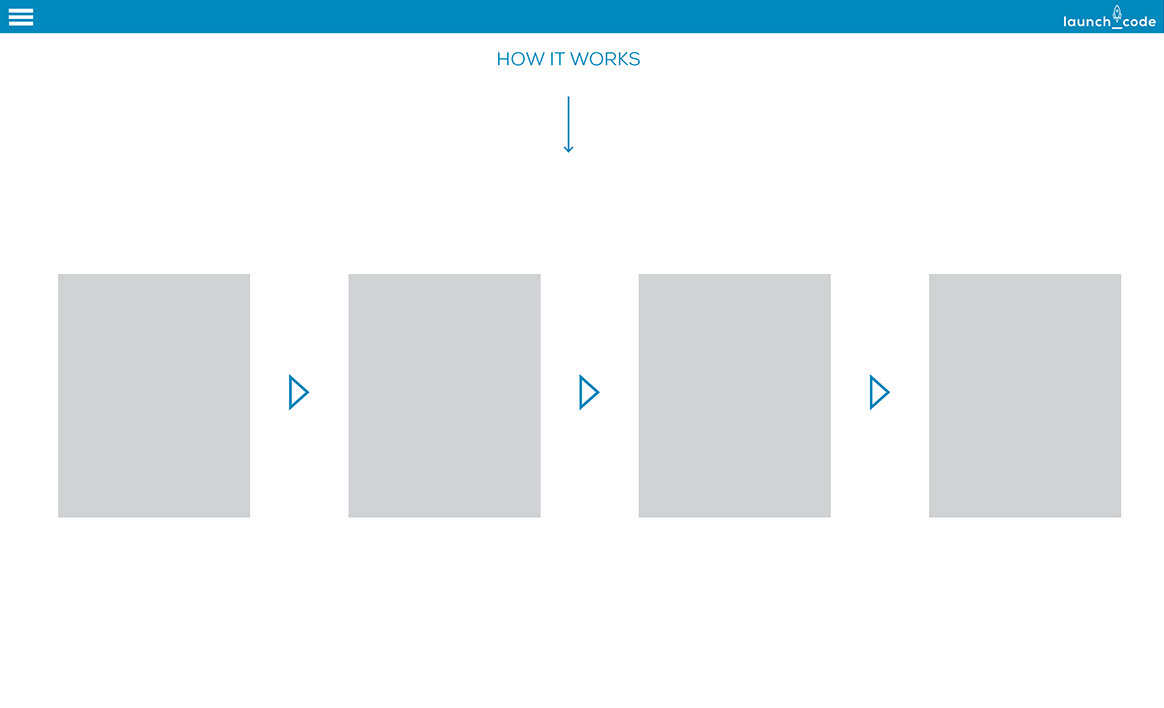
Previously detailed information about the LaunchCode process was buried in the homepage video or on other website pages.
My proposal:
As the user continues to scroll, a clean infographic describing the LaunchCode process appears, which is equally helpful to both potential LaunchCoders and potential company partners.
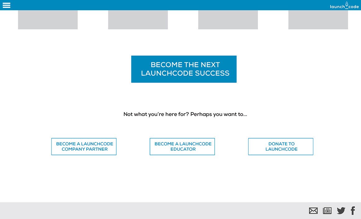
Previously navigation buzzwords were confusing and vague.
Previously all users were treated with equal importance, which confuses the primary user, LaunchCode applicants.
My proposal:
A dominant button clearly directs applicants to the Apply page.
Secondary navigation buttons for secondary audiences are less prominent, with navigation buzzwords that are more accurate and descriptive
The footer is clean and simple, making it easier to view LaunchCode's online presence.
Summer of Code Logo
HCW design a logo for LaunchCode's "Summer of Code" campaign that maintains the tone of the brand and uses the rocket element in a playful way?
Version 1 This version maintains the brand colors and includes the logo adapted with a small beachball in the rocket. It varies text size to convey a level of excitement and importance.
Version 2 This version keeps the branding of the beachball/rocket, but makes it more prominent and experiments with inserting the beach ball colors into the text outline, thus adding excitement and cohesion.
Final Version This version fills in the outlined text to maintain brand guidelines, and adjusts the relationship between the rocket logo and the text to make the branding and the beachball element even more prominent.